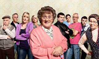
The 'Mrs Browns Boys' poster includes all of the main characters that you see regularly in the series, but Mrs Brown is further forward and looks a little larger than the others. The characters are all in a line with the outfits that help show their personalities, and it seems as if the in-law characters are placed a little further back than the others in line. The background looks like wallpaper that is quite similar to the style of Mrs Browns house interior. The colour is light so it doesn't distract from the bright colours seen on the character's clothing, but also so it doesn't distract from the main character at the front of the image.
Similarly, the 'Gavin & Stacey' and 'Outnumbered' posters include the main characters that are seen throughout the series. The 'Gavin & Stacey' poster is very simple, with a white background and red being the main colour that is seen - both in the title font and Stacey's dress. You can already tell what the characters personalities and relationships are like just by looking at their composition in the image. The character's personalities are also highlighted and clearly presented in the 'Outnumbered' poster. The plain blue background helps the photo strips standout which makes the characters more defined and eye catching, helping the personalities of the characters come through in the pictures.
After looking at the posters of sitcoms that are our inspiration, I looked into posters of other sitcoms that are/or have been on TV. A recurring theme through all of the posters below is the plain background and the colouring. In the 'Seinfeld', 'the Goldbergs' and 'Raising Hope' posters the background is plain with not very bright colours filling it. In contrast 'the Big Bang Theory' poster has a dark green background but with a slight sci-fi effect to it, which clearly shows the theme of the sitcom. I like having the background quite plain, but also having some sort of effect on it to help show the theme of the show. By having the theme clearly being shown in the poster it helps the audience decide whether they want to watch it or not. The yellow and the blue backgrounds in 'the Goldbergs' poster and the 'Raising Hope' poster engages the audience as the colouring is quite bright, but not enough to distract from the main characters. This is something I want to have in our poster as I think it's really effective when getting the audiences attention.
The text stands out against the background, and it's also quite large in all four posters, clearly showing the audience what the show is called. This is a really important element of the poster as it tells the audience the name of the show, and without it the poster might be quite confusing to read as an audience member. The main characters are also clearly presented within all 4 posters so you can tell who will be on the show. The costumes of the characters clearly portray their personalities, for example; in 'the Big Bang Theory' poster the males are wearing suits in comparison to the female wearing a skin tight silver outfit. This presents the male characters as smart and almost nerdy, whilst presenting the female character as someone who cares about her appearance and the complete opposite to nerdy. Similarly in 'the Goldbergs' poster all of the characters are wearing the same outfits, creating the sense that they are a family and it's a family sitcom.
This is something I want to bring into our poster as I think it's effective for the audience to get an idea as to who the characters are, what their relations are and what their personalities are like.
When starting to design our poster, I'm going to keep it quite simple and not overly complicated, much like these examples. I'm going to keep the background plain, but have it fairy colourful, and make sure the characters and their personalities are clearly presented through their compositions. We have previously taken pictures of our actors for this poster, so I will have a few different poses to choose from. I'm also going to try different styles of posters so, as a group, we have a few different ones to choose from when deciding on the final poster.
Doing this research has been really effective when making a sitcom poster as I now know the elements I need to experiment with.


No comments:
Post a Comment